Overview
RTKIOT Visual Designer is a tool to make graphical interface design for Realtek series ICs, its currently supported ICs are shown in the table below.
No |
Supported ICs |
|---|---|
1 |
RTL8762D |
2 |
RTL8762G |
3 |
RTL8763E |
4 |
RTL8772G |
5 |
TBD |
RTKIOT Visual Designer supports:
Drag and widgets from the toolbox and drop them in the Design View.
Drag and drop the widget to change its position in the Design View, or modify the position and appearance of the widget via the Property View.
Export the user designed GUI project to .bin, and the .bin can be programmed into the IC to display graphical interface.
Simulate the GUI project on PC.
This document mainly consists of:
Indroduction to Function Panels
Indroduction to Resource Management
Indroduction to the Menu Bar
Quick start to tutorials
GUI demo project
To simplify the document, “Tool” is used below to refer to “RTKIOT Visual Designer”.
Function Panels
Toolkit/Widgets
Non-containerized widget
Can be used as the parent of other widget.
There is coordinate following relationship between parent and child widgets.
Visible when child widget is out of range of parent widget.
Container widget
Can be used as the parent of other widget.
There is coordinate following relationship between parent and child widgets.
Visible when child widget is out of range of parent widget.
Can drag and drop a widget from the toolbox into the container widget.
This section lists the properties supported by the widget in tables and mark with “Y” or “N” to indicate whether the IC supports them or not.
Non-containerized Widget
Text
Used only for text display and does not support user input. The properties are shown in the table below.
Property |
Description |
8762D/8763E |
8762G/8772G |
TBD |
|---|---|---|---|---|
Name |
Widget name. |
Y |
Y |
Y |
Size (Height) |
Widget height. |
Y |
Y |
Y |
Size (Width) |
Widget width. |
Y |
Y |
Y |
X |
Horizontal coordinate relative to the parent widget. |
Y |
Y |
Y |
Y |
Vertical coordinate relative to the parent widget. |
Y |
Y |
Y |
Text |
Display text. |
Y |
Y |
Y |
Display Mode |
Long text (text content beyond the widget’s range) display mode with the following supported types. |
Y |
Y |
Y |
Font |
Font setting, please refer to Font Setting. |
Y |
Y |
Y |
Font Color (RGBA) |
Font color setting, use RGBA. |
Y |
Y |
Y |
Image
Widget that can set image. The properties are shown in the table below.
Property |
Description |
8762D/8763E |
8762G/8772G |
TBD |
|---|---|---|---|---|
Name |
Widget name. |
Y |
Y |
Y |
Size (Height) |
Widget height. |
Y |
Y |
Y |
Size (Width) |
Widget width. |
Y |
Y |
Y |
X |
Horizontal coordinate relative to the parent widget. |
Y |
Y |
Y |
Y |
Vertical coordinate relative to the parent control. |
Y |
Y |
Y |
Image |
Image Path |
Y |
Y |
Y |
Image Rotation Angle |
Image rotation angle. |
Y |
Y |
Y |
Image Scale X |
Image horizontal scaling degree, is a multiplier/percentage. |
Y |
Y |
Y |
Image Scale Y |
Image vertical scaling degree, is a multiplier/percentage. |
Y |
Y |
Y |
Note:
When exporting, tool will convert the imported images. And the image conversion parameters can be set in “Menu Bar -> Setting -> Image Convert Setting”, please refer to Image Convert Setting for details.
If the size of the imported image does not match the size of the widget, tool doesn’t scale or crop the image.
SeekBar
Sliding widget that can respond to user swipe gesture with the widget and change the progress value. The properties are shown in the table below.
Property |
Description |
8762D/8763E |
8762G/8772G |
TBD |
|---|---|---|---|---|
Name |
Widget name. |
Y |
Y |
Y |
Size (Height) |
Widget height. |
Y |
Y |
Y |
Size (Width) |
Widget width. |
Y |
Y |
Y |
X |
Horizontal coordinate relative to the parent widget. |
Y |
Y |
Y |
Y |
Vertical coordinate relative to the parent control. |
Y |
Y |
Y |
Color(Highlight) (RGBA) |
Background color of partially completed part of progress bar. |
N |
Y |
N |
Color (RGBA) |
Background color of the whole progress bar. |
N |
Y |
N |
Orientation |
Widget display orientation and gesture response orientation with the following types: |
Y |
Y |
Y |
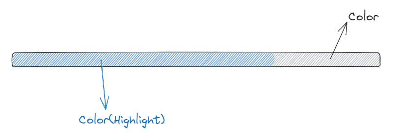
Image SeekBar
Sliding widget with multi-images as background, and switch to different images as user swipes. The properties are shown in the table below.
Property |
Description |
8762D/8763E |
8762G/8772G |
TBD |
|---|---|---|---|---|
Name |
Widget name. |
Y |
Y |
Y |
Size (Height) |
Widget height. |
Y |
Y |
Y |
Size (Width) |
Widget width. |
Y |
Y |
Y |
X |
Horizontal coordinate relative to the parent widget. |
Y |
Y |
Y |
Y |
Vertical coordinate relative to the parent control. |
Y |
Y |
Y |
Degree (Start) |
Start degree (Invalid if orientation is arc). |
Y |
Y |
Y |
Degree (End) |
End degree (Invalid if orientation is arc). |
Y |
Y |
Y |
Image Directory |
Folder that contains only the images to be displayed on this widget. |
Y |
Y |
Y |
Central X |
Horizontal coordinate of the center of the arc relative to the parent widget. |
Y |
Y |
Y |
Central Y |
Vertical coordinate of the center of the arc relative to the parent widget. |
Y |
Y |
Y |
Orientation |
Widget display orientation and gesture response orientation with the following types: |
Y |
Y |
Y |
Switch
Switch widget with “Checked” and “Unchecked” states. The properties are shown in the table below.
Property |
Description |
8762D/8763E |
8762G/8772G |
TBD |
|---|---|---|---|---|
Name |
Widget name. |
Y |
Y |
Y |
Size (Height) |
Widget height. |
Y |
Y |
Y |
Size (Width) |
Widget width. |
Y |
Y |
Y |
X |
Horizontal coordinate relative to the parent widget. |
Y |
Y |
Y |
Y |
Vertical coordinate relative to the parent control. |
Y |
Y |
Y |
BG Image (Checked) |
Checked state background image. |
Y |
Y |
Y |
BG Image (Default) |
Unchecked state background image. |
Y |
Y |
Y |
Arc
Arc widget, no gesture support yet. The properties are shown in the table below.
Property |
Description |
8762D/8763E |
8762G/8772G |
TBD |
|---|---|---|---|---|
Name |
Widget name. |
Y |
Y |
N |
Size (Height) |
Widget height. |
Y |
Y |
N |
Size (Width) |
Widget width. |
Y |
Y |
N |
X |
Horizontal coordinate relative to the parent widget. |
Y |
Y |
N |
Y |
Vertical coordinate relative to the parent control. |
Y |
Y |
N |
Central X |
Horizontal coordinate of the center of the arc relative to the parent widget. |
N |
Y |
N |
Central Y |
Vertical coordinate of the center of the arc relative to the parent widget. |
N |
Y |
N |
BG Color |
Arc background color. |
N |
Y |
N |
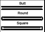
Cap Mode |
Arc cap mode, the following options are supported: |
N |
Y |
N |
Degree (End) |
End degree of arc. |
N |
Y |
N |
Degree (Start) |
Start degree of arc. |
N |
Y |
N |
Radius |
Radius of arc. |
N |
Y |
N |
Stroke Width |
Width of arc stroke. |
N |
Y |
N |
Container widget
Screen
Screen widget, corresponds to the physical screen, is the root widget of a GUI project. The properties are shown in the table below.
Property |
Description |
8762D/8763E |
8762G/8772G |
TBD |
|---|---|---|---|---|
Name |
Widget name. |
Y |
Y |
Y |
Size (Height) |
Widget height. |
Y |
Y |
Y |
Size (Width) |
Widget width. |
Y |
Y |
Y |
X |
Horizontal coordinate, always 0. |
Y |
Y |
Y |
Y |
Vertical coordinate, always 0. |
Y |
Y |
Y |
Note: Only “Name” property can be modified.
TabView and Tab
With Tab widget as child widget, it supports up/down/left/right swiping to switch among Tabs. The properties of Tabview and Tab are shown in the table below.
Property |
Description |
8762D/8763E |
8762G/8772G |
TBD |
|---|---|---|---|---|
Name |
Widget name. |
Y |
Y |
Y |
Size (Height) |
Widget height. |
Y |
Y |
Y |
Size (Width) |
Widget width. |
Y |
Y |
Y |
X |
Horizontal coordinate relative to the parent widget, always 0. |
Y |
Y |
Y |
Y |
Vertical coordinate relative to the parent widget, always 0. |
Y |
Y |
Y |
Transition |
Tab transition mode with the following supported types: |
N |
Y |
Y |
Property |
Description |
8762D/8763E |
8762G/8772G |
TBD |
|---|---|---|---|---|
Name |
Widget name. |
Y |
Y |
Y |
Size (Height) |
Widget height. |
Y |
Y |
Y |
Size (Width) |
Widget width. |
Y |
Y |
Y |
X |
Horizontal coordinate relative to TabView widget, always 0. |
Y |
Y |
Y |
Y |
Vertical coordinate relative to TabView widget, always 0. |
Y |
Y |
Y |
Index(X-Axis) |
Horizontal index of Tabs in TabView. |
Y |
Y |
Y |
Index(Y-Axis) |
Vertical index of Tabs in TabView. |
Y |
Y |
Y |
Notes:
TabView width and height could not be modified, defaulting to Screen’s width and height.
TabView horizontal and vertical coordinate could not be modified, is always 0.
TabView can only be used as a child of Screen widget.
TabView’s child widgets can only be Tabs.
Tab’s width and height could not be modified, defaulting to TabView’s width and height.
Tab’s horizontal and vertical coordinate could not be modified and is always 0.
Page
Container widget with scrollable content.
Notes:
Page only supports vertical scrolling.
The width and height of the Page widget only defines the area of the interface that can response to a swipe gesture. Whether scrolling is allowed depends on whether or not the child widget added to it are outside the scope of the screen.
Property |
Description |
8762D/8763E |
8762G/8772G |
TBD |
|---|---|---|---|---|
Name |
Widget name. |
Y |
Y |
Y |
Size (Height) |
Widget height. |
Y |
Y |
Y |
Size (Width) |
Widget width. |
Y |
Y |
Y |
X |
Horizontal coordinate relative to the parent widget. |
Y |
Y |
Y |
Y |
Vertical coordinate relative to the parent control. |
Y |
Y |
Y |
Win
Within the area defined by Win width and height, it can response to variable gestures, including click, long click, press, press release and swipe. The properties are shown in the table below.
Property |
Description |
8762D/8763E |
8762G/8772G |
TBD |
|---|---|---|---|---|
Name |
Widget name. |
Y |
Y |
Y |
Size (Height) |
Widget height. |
Y |
Y |
Y |
Size (Width) |
Widget width. |
Y |
Y |
Y |
X |
Horizontal coordinate relative to the parent widget. |
Y |
Y |
Y |
Y |
Vertical coordinate relative to the parent control. |
Y |
Y |
Y |
Hidden |
Indicate whether Win and its child widget need to be hidden. |
Y |
Y |
Y |
Design View/Canvas
Users can drag and drop widgets from the Toolbox panel into the Design View, adjust the widgets layout and set properterties to design a graphical interface that can be rendered in the Realtek ICs.
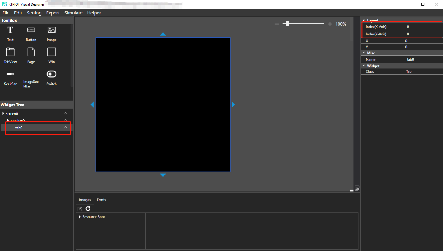
TabView - Create/Delete/Insert Tab
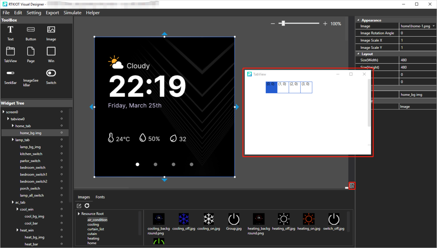
Drag and drop TabView widget from the Toolbox into the Design View, then a TabView that contains only a home tab (coordinates (0,0)) is created, as shown in the figure below.
Create Tab
New Tabs can be created by clicking the buttons around the Design View.
Notes:
If idx is 0, up and down button is enabled.
If idy is 0, left and right button is enabled.
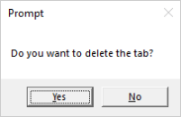
Delete Tab
Select the Tab to be deleted, click “Edit -> Delete” on the menu bar or press the Delete key on the keyboard. Then double-check if you want to delete it.
Insert Tab
Currently, Tab insertion is only supported by modifying the coordinates of an existing Tab and creating a new one.
For example, Tab need to be inserted between Tabs with coordinates (1, 0) and (2, 0), the steps are as follow.
Increase the idx of Tab (2,0) and the Tabs to its right by 1, as shown in the figure below;
Switch to Tab (1,0) and click to create new Tab (2, 0).

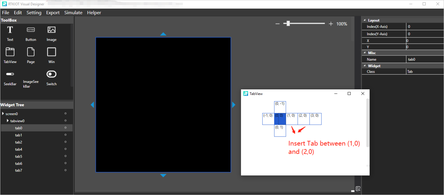
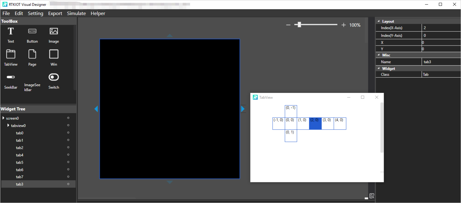
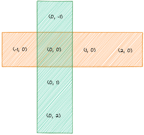
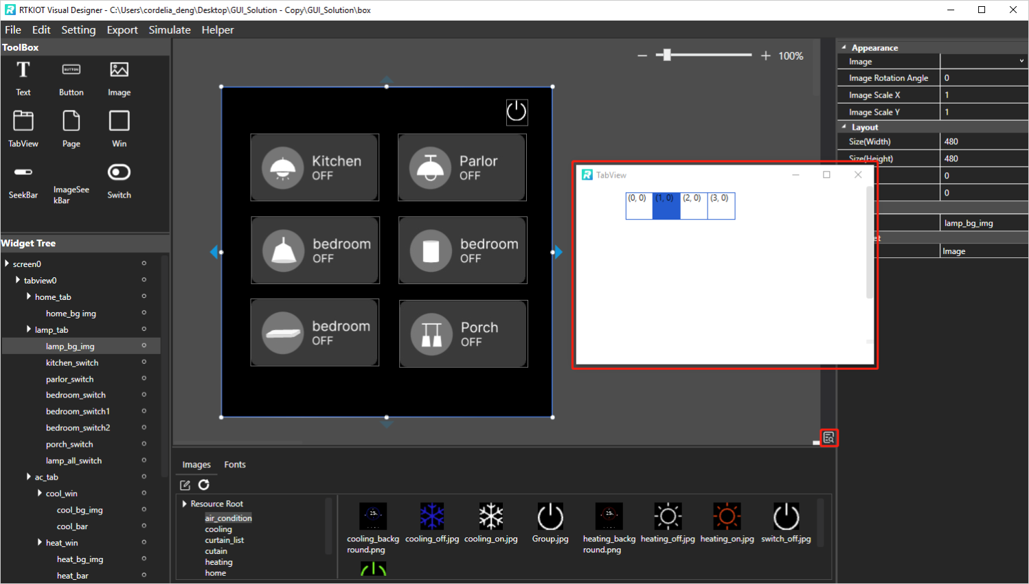
Tabview Overview Chart
Please click  to show TabView Overview Chart.
Notes:
The highlight Tab in the Overview Chart indicates the Tab that is currently being edited in Design View.
The Overview Chart label each Tab with its coordinates. When simulate or rendered in ICs, the Tab with coordinates (0,0) is displayed on the Home page, and users can swipe up/down/left/right to display other Tabs.
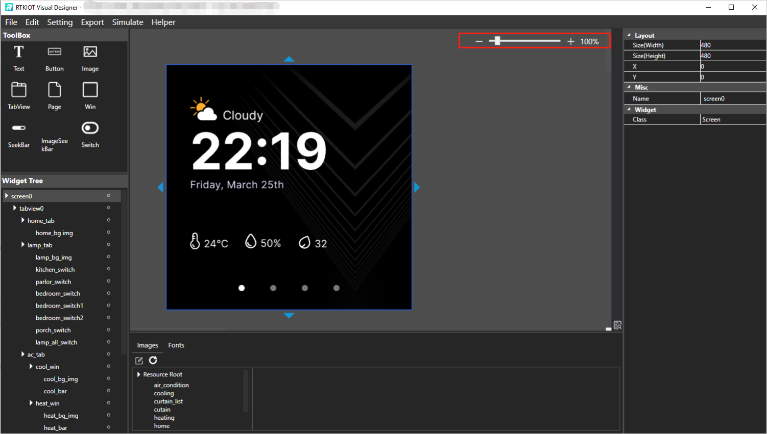
Zoom of Design View
There are 3 ways to zoom the Design View.
Press Ctrl key and wheel mouse.
Click “-” and “+” button.
Drag the slider bar.
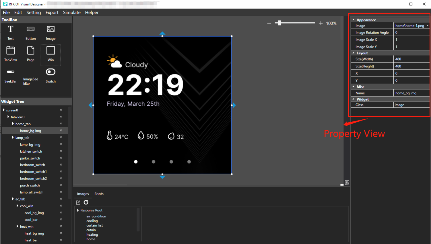
Property View
Selecting a widget in the Widget Tree or Design View exposes all of the widget’s property values, which the users can modify as needed.
Widget Tree
The Widget Tree is used to present to the users the parent/child/sibling relationship of the currently laid out widgets. And we have the following convention here.
The child widget layer is on top of the parent widget layer, i.e., when the parent and child widget overlap, the child widget will cover the parent widget.
The layer of sibling widgets is related to the order in which the widgets are added, with widgets add first at bottom and widgets added later at the top.
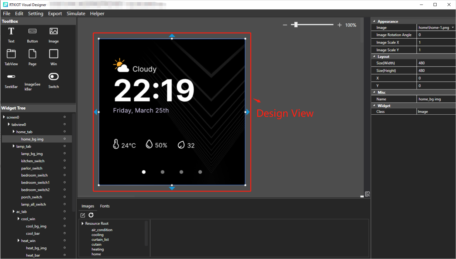
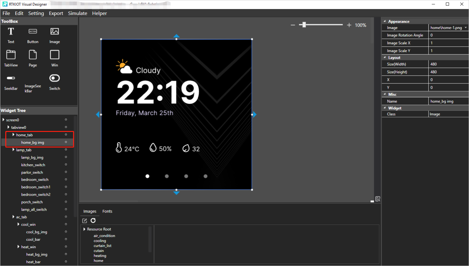
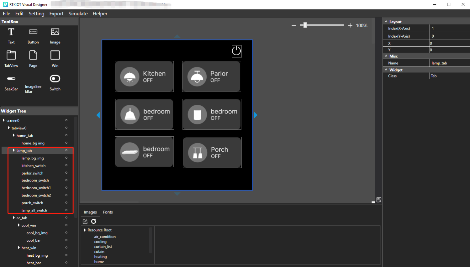
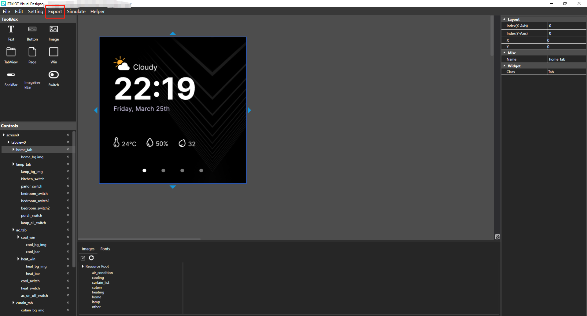
The figure shows all the child widgets of the Home tab and Lamp tab, where the Home tab has only one Image child widget for setting the background, and the Lamp tab contains an Image widget and a number of Switch widgets.
Widget Tree supports the following operations.
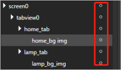
Select widget: If you select a widget on the Widget Tree, the corresponding widget in the Design View focuses and its properties are shown on Property View.
Modify the parent-child relationship: Select a widget on the Widget Tree (except Tab/TabView/Screen) and drag-and-drop it on the target widget item. Then the widget will be a child widget of the target widget.
Modify widget layers: Select a widget on the Widget Tree (except Tab/TabView/Screen) and drag-and-drop it to the upper or lower edge of the target widget item. Then on the Design View, the widget will be placed over or under the target widget.
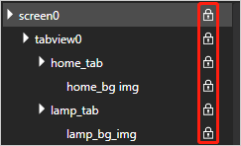
Lock widgets: Click the button and lock the widget/widgets.
If click the lock button of screen, all the screen’s child widgets will be locked, then user could not drag or resize the widgets on Design View.
If clik the lock button of Tab, all the tab’s child widgets will be locked, then user could not drag or resize the widgets on Design View.
Resource Mangement
Only pre-imported image and font files can be referenced by the GUI project. This chapter focus on how to manage image and font resource. The image and font explorer is located directly below the design view, as shown in the figure below.

Image Resource Management
Click  to bring up the Image Management view.
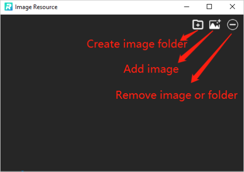
Add Images
Images can be added to the GUI project by following the process below.
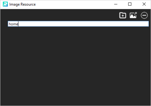
Click
 to create a new image folder and enter the folder name.
The created folder is located in the Resouce\image folder under the GUI project directory.
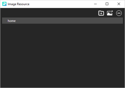
to create a new image folder and enter the folder name.
The created folder is located in the Resouce\image folder under the GUI project directory.
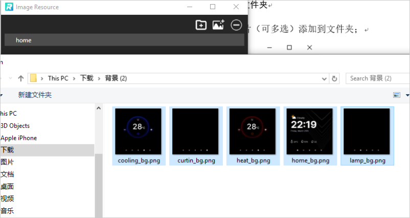
Select the created image folder and click
 to select images (multiple selection is possible) to add them to the folder.
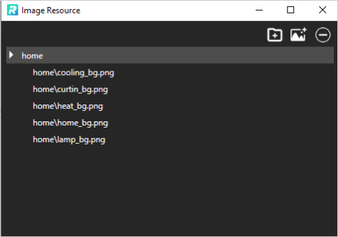
As shown in the figure below, the images are copied to the Resource\image\home folder after the addition is completed.
to select images (multiple selection is possible) to add them to the folder.
As shown in the figure below, the images are copied to the Resource\image\home folder after the addition is completed.
Remove Images/Image Folder
Select the image or image folder to be removed, and click  .
.
Rename Image Folder
Select the image folder, double click and enter a new name.
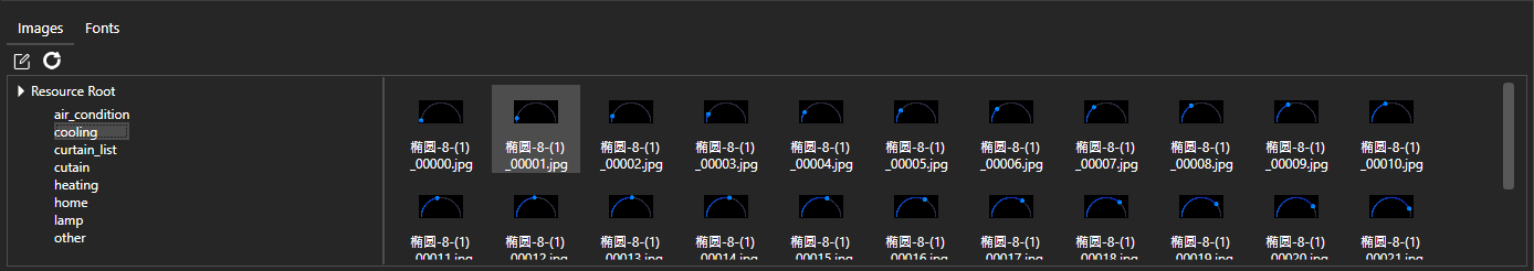
Preview Images
Select the image folder and all images in this folder will be displayed in the right area.
Refresh
If the user locally operates the image resources, not via Tool, you can click  to refresh.
Note: Not recommended.
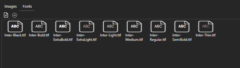
Font Resource Management
Add Third-Party Font
If need use a third-party font (.ttf), please click  to import the resource first, otherwise the locally installed font will be used.
Remove Third-Party Font
Select the font to be removed and click .
Menu Bar
File
Start Page
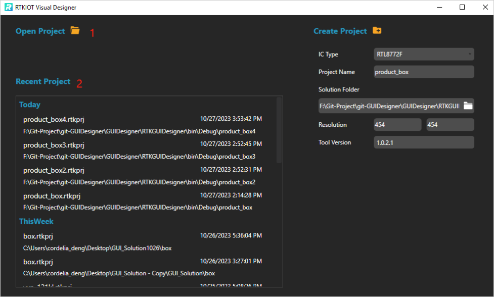
If you want to close the current project and open an existed project or create a new project, you can open the Start Page by click “File -> Start Page”. Click “Open Project” or select a .rtkprj and double click to open the existed project, or click “Create Project” to create a new project, please refer to How to Create Project and How to Open Project.
Save
Save all the UI changes of the project, the shortcut is Ctrl + S.
Exit Save
Prompt window will pop-up when you close the project, as shown below. Please click “OK” to save, or the changes will be abandoned.

Edit
Copy/Paste
Click “Edit -> Copy” to copy the selected widget, the shortcut is Ctrl + C.
Click “Edit -> Paste” to create a copy of the selected widget on the Design View, the shortcut is Ctrl + V.
Delete
Click “Edit -> Delete” to delete the selected widget, or press “Delete” key on the keyboard.
Undo/Redo
Undo: Undo the change made to the widget, the shortcut is Ctrl + Z. Redo: Do the change to the widget again, the shortcut is Ctrl + Y.
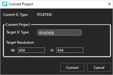
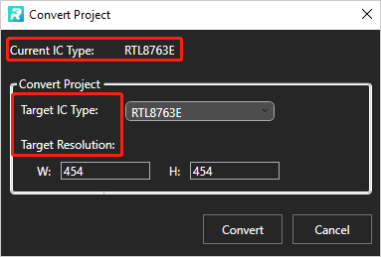
Convert Project
The Convert Project window is used to convert the IC type and screen size/resolution for current project.
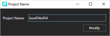
Project Name Modification
The Project Name window is used to modify current project name. Please enter the new name in the input box.
Setting
Image Convert Setting
The images must be converted to be displayed correctly on the IC, so users need to set the correct convert parameters. All the optional parameters are shown in the figure below.
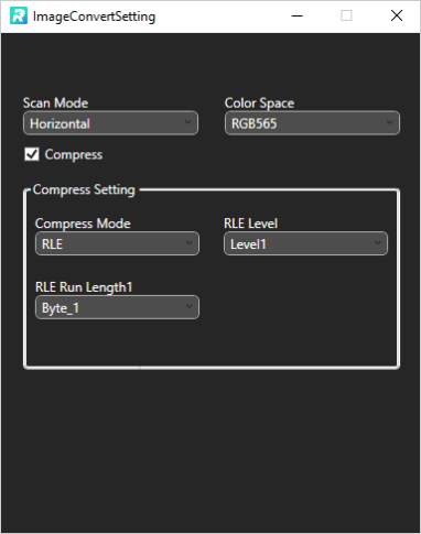
The parameters are described as follows.
Scan Mode
The available options are shown in the table.
Scan Mode |
Description |
|---|---|
Horizontal |
Horizontal scan. |
Vertical |
Vertical scan. |
Color Space
Color space of Image, the available options are shown in the table below.
Color Space |
Description |
|---|---|
RGB565 |
16 bit RGB mode |
RTKARGB |
16 bit ARGB mode |
RTKRGAB |
16 bit RGAB mode |
RGB |
24 bit RGB mode |
RGBA |
32 bit RGBA mode |
BINARY |
2-value (0 or 1) image. |
Compress
If check “Compress”, please set the compression parameter as needed. The optional Compress Mode is as follows:
RLE: Run-Length Encoding, a lossless compression algorithm. If you select RLE as the Compress Mode, RLE Level and RLE Run Length parameter are mandatory to set.
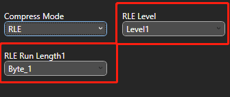
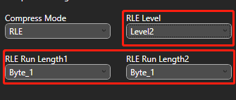
RLE Level |
Description |
|---|---|
Level1 |
1-level compress. |
Level2 |
2-level compress, secondary compress based on the 1-level compress. |
RLE Run Length |
Description |
|---|---|
Byte_1 |
1 byte, Maximum 255. |
Byte_2 |
2 bytes, Maximum 255. |
Maximum length of duplicate characters allowed per stroke (Run) during compression.
FastLz: A dictionary-and-sliding-window based lossless compression algorithm for compressing data with a large number of repetitive values.
YUV_Sample_Blur: A lossy compression algorithm combining YUV sampling and blurring. YUV Sample: Keep the luminance information of the image and only sample the chrominance information. Blur: Discard the lower bit of each byte after YUV sampling to achieve the purpose of data compression.
YUV Sample Mode |
Description |
|---|---|
YUV444 |
4 pixel data are sampled to 4 Y, 4 U and 4 V, i.e., each Y corresponds to a set of UV components, fully preserving the YUV data. |
YUV422 |
Every 4 pixel data are sampled to 4 Y, 2 U and 2 V, i.e., every 2 Y corresponds to a set of UV components, data size is 75% of the original. |
YUV411 |
Every 4 pixel data are sampled to 4 Y, 1 U and 1 V, i.e., every 4 Y corresponds to a set of UV components, data size is 50% of the original. |
YUV422 |
Y - luminance; V - chrominance. |
Blur Mode |
Description |
|---|---|
Bit0 |
Saving without discarding lower bit. |
Bit1 |
Each byte discards bit0 (preserve [bit7:bit1]). |
Bit2 |
Each byte discards [bit1:bit0] (preserve [bit7:bit2]). |
Bit4 |
Each byte discards [bit3:bit0] (preserve [bit7:bit4]). |
YUV_Sample_Blur+FastLz: Algorithm combines YUV_Sample_Blur and FastLz.
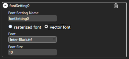
Font Convert Setting
Include Bitmap Fonts and Vector Fonts. Fonts supported by Realtek series ICs are shown in the table below. Attention: You should create at least one Font Convert Setting, otherwise you could not select font for the text-type widget in the Property View.
Font |
8762D/8763E |
8762G/8772G |
TBD |
|---|---|---|---|
Vector |
N |
N |
Y |
Bitmap |
Y |
Y |
Y |
To use Bitmap Fonts, you need to set the following parameters.
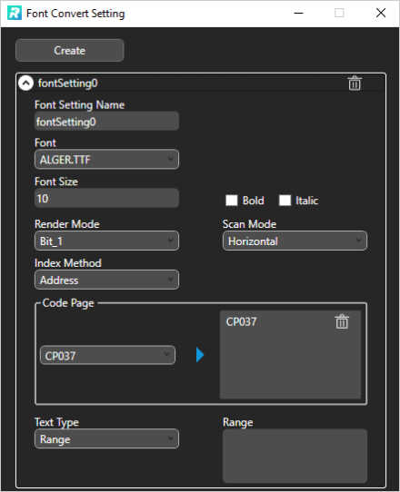
The following table lists the description of each parameter.
Parameters |
Description |
|---|---|
Font Setting Name |
User-defined font setting name. |
Font Size |
Font size. |
Bold |
Bold or not. |
Italic |
Italic or not. |
Render Mode |
Bit number used to represent a pixel in the converted .bin file. |
Scan Mode |
There are two ways to scan when saving .bin. |
Index Method |
Index method of the converted .bin’s re-indexing area. |
Code Page |
Support multiple code page. |
Text Type |
The types are as following. |
Vector Font parameters are shown in the figure below.
Export
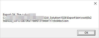
If you have finished designing the GUI project and want to program it to the IC, please click “Export”, then the Tool performs the following actions:
Image convert
Font convert
Pack the .xml, .js, images and fonts into the output .bin.
When the above actions are done, a message box pops up.

The .bin can be programmed into your IC.
Simulate
Simulate the project on UI. Attention: When you simulate the project at the first time, please click “Export” before clicking “Simulate”. And then, there is no need to click “Export” again if you didn’t modify any image or font setting.
Quick Start To Tutorials
How to Create Project
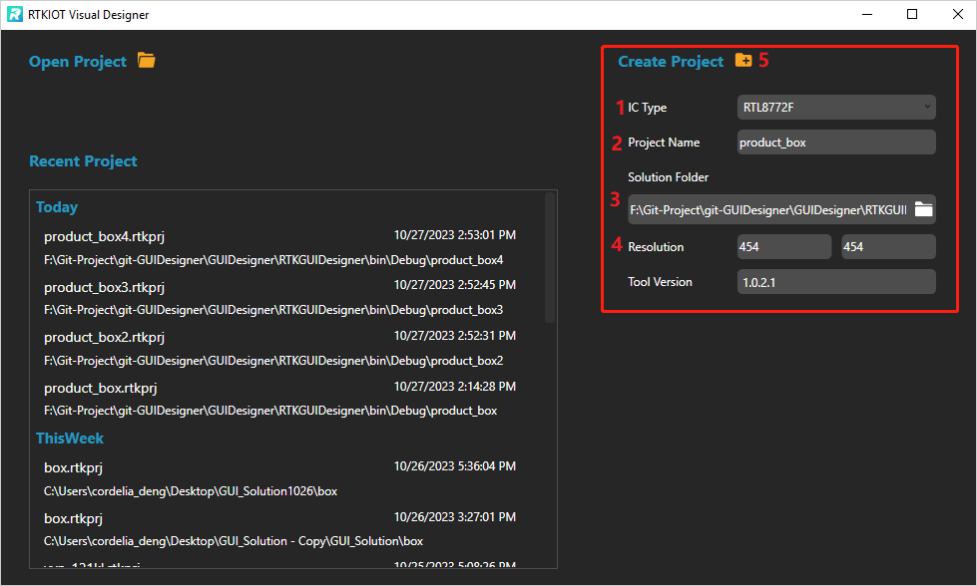
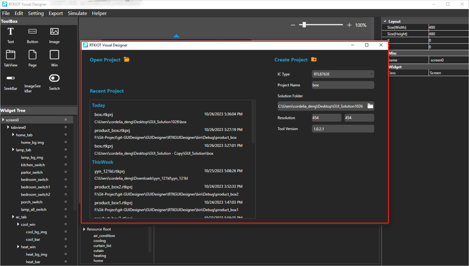
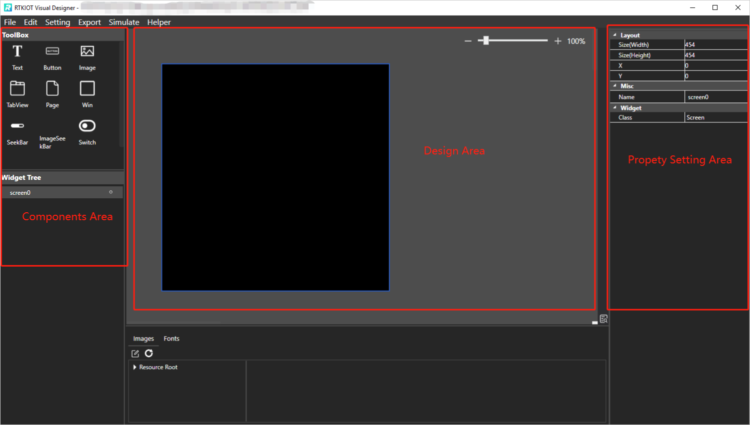
Double click and run “RVisualDesigner.exe”, and then configure the project step by step (1~4) and click “Create Project” (5). After creation, the GUI design window pops up. The left side is the component area, the center is the design area, and the right side is the widget property setting area.
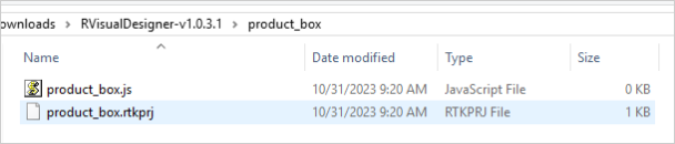
Note: The newly created project file is located in the project folder under the Solution Folder. There is an example as shown in the figure below.
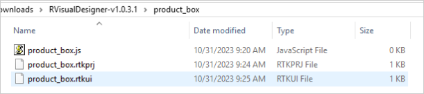
After you drag and drop a widget on Design View, and click “File - Save” or press Ctrl + S, the .rtkui file will be created.
How to Write Javascript Code
After the project is created, the xxx.js file is created. The xxx.js file is empty, please code here to implement the widgets’ event callback.
How to Open Project
There are two ways to open project.
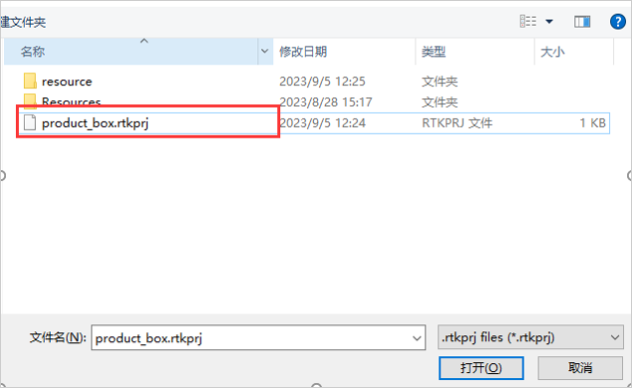
Click “Open Project” and select a .rtkprj file.
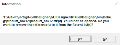
Select a .rtkprj in Recent Project area. If the project listed on Recent Project area, a message window pops up.
How to Open/Close Project
Click “File -> Start Page” on Menu Bar.
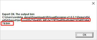
How to Export/Pack Project
Click “Export” on Menu Bar, the output are shown in the figure below.
How to Simulate
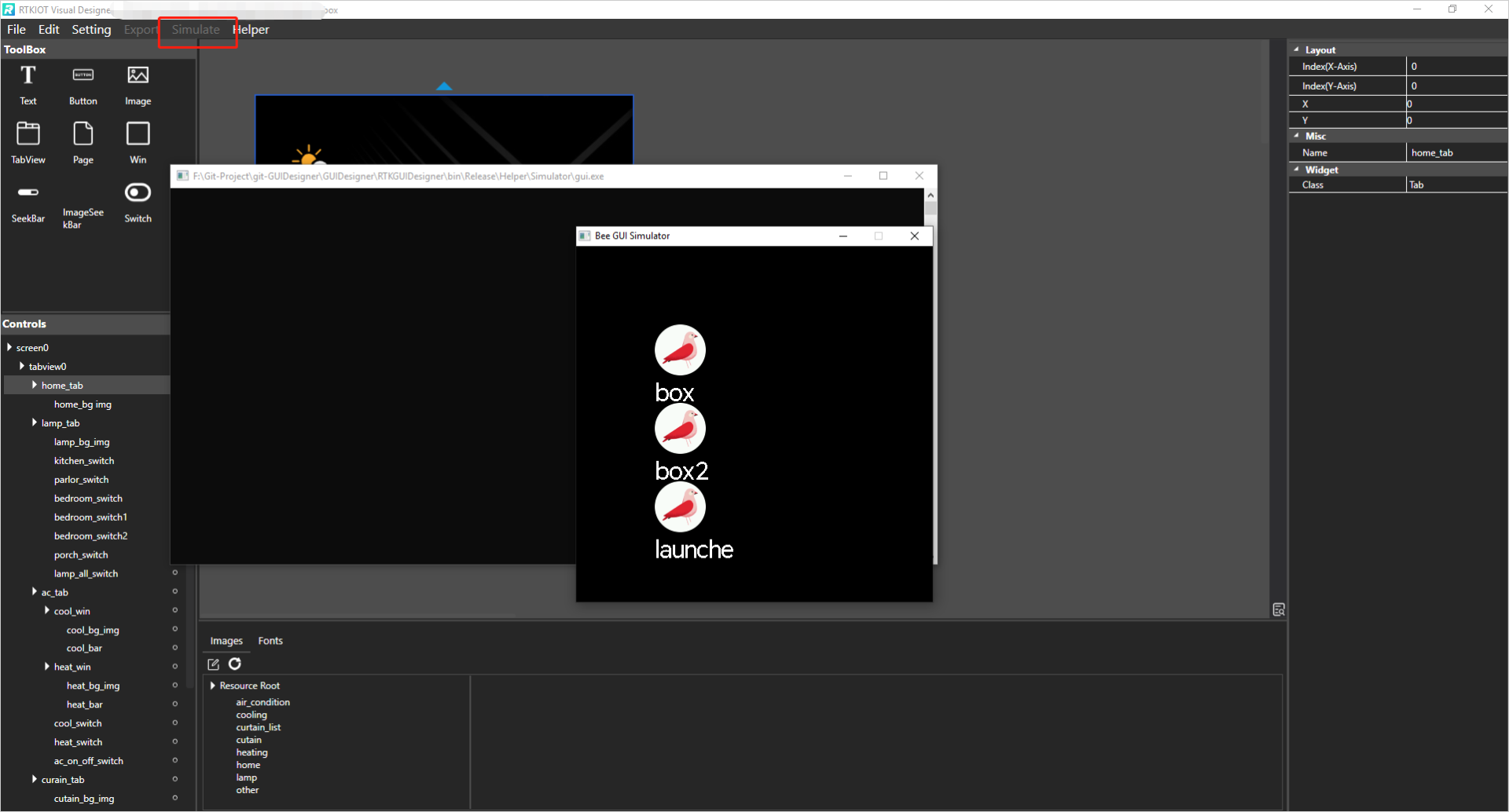
Click on the “Simulate” button in the menu bar.
GUI Demo Project
There is a Demo in RVisualDesigner-vx.x.x.x.zip.
The folder - 454x454 contains project with resolution 454*454.
The folder - 480x480 contains project with resolution 480*480.
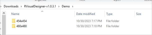
Please follow the steps to demo the project.
Open the project according to the screen size/resolution of your IC.
Check the IC type by clicking “Edit - Convert Project” on Menu Bar, please refer to “Convert Project” for details. If current IC type of the project does not match your IC, please select target IC type, enter the target resolution and click “Convert”.
Click “Export” on Menu Bar and wait until the export ok/fail message box pops up.
Program the output .bin into your IC.