Designer Usage
HoneyGUI Visual Designer provides an intuitive visual design environment with drag-and-drop operations, real-time preview, and a rich component library.
Designer Interface
Interface Layout
The designer uses a classic four-area layout:
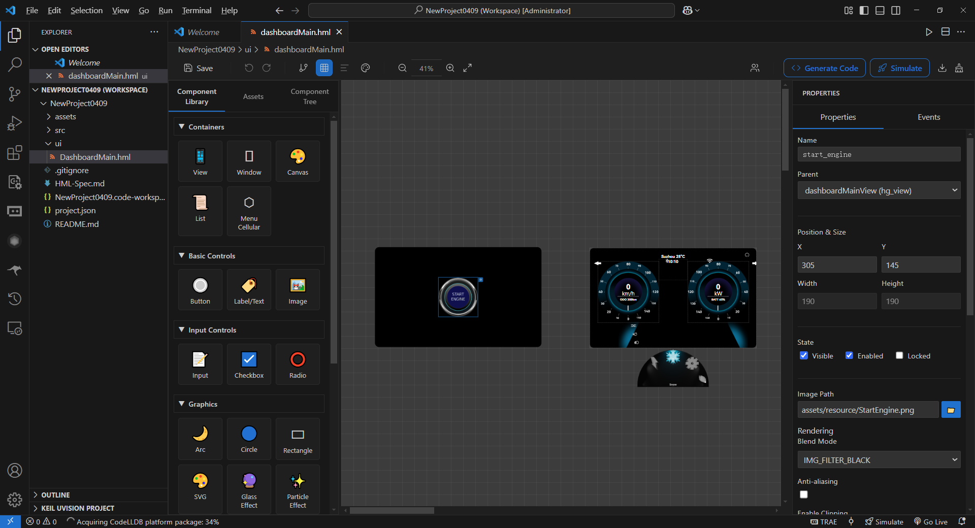
Designer Interface Layout
-
Toolbar (Top)
Save, undo, redo buttons
Code generation and build/simulation buttons
Grid settings, view switching and other auxiliary tools
-
Sidebar (Left, with Tab switching)
Tab 1 - Component Library: All available HoneyGUI components
Tab 2 - Assets Panel: Images, fonts, videos and other resources in the project
Tab 3 - Component Tree: Component hierarchy of the current interface
-
Canvas (Center)
Design area showing the actual interface
Supports zoom (25% - 800%)
Supports pan and grid snapping
-
Properties Panel (Right)
Edit properties of the selected component
Includes position, size, color, text, events, etc.
Toolbar Features
Common Operations
Save: Save current design to HML file (
Ctrl+S)Undo: Undo last operation (
Ctrl+Z), supports 50-step historyRedo: Redo undone operations (
Ctrl+Y)Generate Code: Convert HML files to C code
Build and Simulate: Start complete build and simulation workflow
View Tools
-
Zoom: Adjust canvas display scale (25% - 800%)
Zoom in:
Ctrl++Zoom out:
Ctrl+-Reset:
Ctrl+0
-
Grid Settings: Configure grid size and snapping
Default grid size: 8px
Modifiable in settings:
honeygui.ui.gridSize
View Switch: Switch to other HML view files
Component Library
Component Categories
HoneyGUI provides rich components in the following categories:
Container Components
hg_view: View container for organizing interface layout
hg_window: Window container with multi-window management support
hg_canvas: Custom drawing canvas (TODO)
hg_list: List container with scrolling support
hg_menu_cellular: Cellular menu container
Basic Controls
hg_button: Button with text and icon support
hg_label: Text label with multi-line text support
hg_image: Image display supporting multiple formats
Input Controls
hg_input: Text input box
hg_checkbox: Checkbox (TODO)
hg_radio: Radio button (TODO)
Graphic Controls
hg_arc: Arc shape
hg_circle: Circle shape
hg_rect: Rectangle shape
hg_svg: SVG graphics
hg_glass: Glass effect
hg_particle: Particle effect
Multimedia Components
hg_video: Video player
hg_gif: GIF animation
hg_3d: 3D model display
hg_lottie: Lottie animation
Using Components
Adding Components
Find the desired component in the left component library
Click and drag to the canvas
Release the mouse, and the component will be added at the current position
The component will automatically snap to the grid (if enabled)
Tip
Hold Shift key to disable grid snapping for pixel-perfect positioning.
Adding from Assets Panel
For image resources, you can drag directly from the assets panel:
Switch to Tab 2 - Assets Panel
Drag an image to the canvas
An
hg_imagecomponent will be automatically created with the image path set
Canvas Operations
Selecting Components
Single Selection
Click on a component in the canvas to select it
Selected component shows a blue border and control points
Multiple Selection
Hold
Ctrlkey and click multiple components in sequenceOr hold left mouse button and drag to create a selection rectangle
Moving Components
Drag the selected component to a new position
When multiple are selected, all selected components move together
Reference lines appear during movement to assist alignment
Resizing
After selecting a component, drag the control points on the edges
Eight control points correspond to eight directions
Hold
Shiftkey for proportional scaling
Alignment and Distribution
After selecting multiple components, use alignment and distribution tools:
Align Left: Align all components' left edges
Align Right: Align all components' right edges
Align Top: Align all components' top edges
Align Bottom: Align all components' bottom edges
Align Center Horizontally: Center all components horizontally
Align Center Vertically: Center all components vertically
Distribute Horizontally: Evenly distribute horizontal spacing
Distribute Vertically: Evenly distribute vertical spacing
Component Layers
Right-click menu provides layer adjustment options:
Bring to Front: Move component to topmost layer
Send to Back: Move component to bottommost layer
Bring Forward: Move up one layer
Send Backward: Move down one layer
Component Tree
The component tree is located in Tab 3 on the left, showing the component hierarchy of the current interface.
Tree Structure
Parent components can contain multiple child components
Child components can be further nested
Drag components to change parent-child relationships
main_view (hg_view)
├── header (hg_view)
│   ├── title (hg_label)
│   └── logo (hg_image)
├── content (hg_view)
│   ├── btn1 (hg_button)
│   ├── btn2 (hg_button)
│   └── list (hg_list)
└── footer (hg_view)
Tree Operations
Click: Select component (canvas highlights synchronously)
Drag: Change component parent-child relationship or order
-
Right-click: Show context menu
Copy, paste, delete
Rename component ID
Adjust layers
Expand/Collapse: Click the arrow before the node
Tip
Use the component tree to easily manage complex nested structures, especially when components overlap on the canvas.
Properties Panel
The properties panel is located on the right, displaying all configurable properties of the selected component.
Basic Properties
Properties common to all components:
-
ID: Unique identifier of the component
Must be unique
Can only contain letters, numbers, underscores
Used for code generation and event binding
-
Position and Size
x: Horizontal position (relative to parent)y: Vertical position (relative to parent)w: Widthh: Height
-
Visibility
visible: Whether visibleopacity: Opacity (0-255)
-
Rotation and Scale
rotation: Rotation anglescaleX: Horizontal scale ratioscaleY: Vertical scale ratio
Specific Properties
Different components have different specific properties:
hg_label
text: Text content (multi-line supported)fontSize: Font sizecolor: Font colorfontFile: Font file pathhAlign: Horizontal alignment (LEFT, CENTER, RIGHT)vAlign: Vertical alignment (TOP, MID)letterSpacing: Letter spacinglineSpacing: Line spacingwordWrap: Whether to auto wrap
hg_image
src: Image file path
hg_arc / hg_circle / hg_rect
color/fillColor: Coloropacity: Opacity (0-255)useGradient: Whether to enable gradient
Event Properties
Components can configure event responses:
onClick: Click event
onLongPress: Long press event
onSwipe: Swipe event
onChange: Value change event
See Event System chapter for details.
Color Picker
For color properties, the properties panel provides a color picker:
Click the color square to open the picker
Supports RGB, HSL color modes
Can directly input hexadecimal color values (e.g.,
#FF0000)Supports transparency settings
Keyboard Shortcuts
Editing Operations
Ctrl+S: SaveCtrl+Z: UndoCtrl+Y: RedoCtrl+C: CopyCtrl+V: PasteCtrl+X: CutDelete: Delete selected component
View Operations
Ctrl++: Zoom in canvasCtrl+-: Zoom out canvasCtrl+0: Reset zoomSpace+ drag: Pan canvas
Selection Operations
Ctrl+ click: Multi-selectCtrl+A: Select allEsc: Deselect
Precise Positioning
Arrow keys: Move component 1 pixelShift+ arrow keys: Move component 10 pixelsShift+ drag: Disable grid snapping
Best Practices
Component Naming
Use meaningful IDs:
login_buttoninstead ofbutton1Follow naming conventions: use lowercase letters and underscores
Avoid special characters and non-ASCII characters
Layout Tips
Use containers (
hg_view) to organize related componentsMake good use of grid snapping to maintain alignment
Use component tree to manage complex nesting
Performance Optimization
Avoid overly deep component nesting (recommended max 5 layers)
For large interfaces, consider splitting into multiple HML files
Hide invisible components to reduce rendering overhead
Collaborative Development
Regularly save and sync HML files
Use version control (like Git) to manage HML files
Avoid multiple people editing the same HML file simultaneously
Next Steps
Understand HML File Format for manual editing
Master Event System to implement interactions
Learn Code Generation to understand code structure